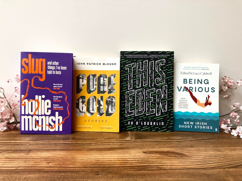
These days, you don’t even have to take a book off the shelves to enjoy the experience of being in a bookshop. Book covers have become artworks in their own rights, and browsing a well laid out bookshop isn’t unlike being at an exhibition of sorts. The show in question contains everything from bold, colourful graphics and enigmatic abstract covers, to more delicate minimalist design, and everything else in between.
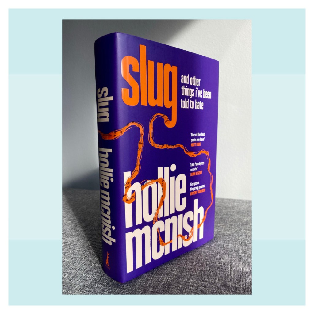
In this digital age of overcommunication, speed and an abundance of choice, where cover design is now an integral part of all promotional campaigns, the pressure is on for book jacket designers to continuously experiment and innovate. Rising to this challenge is book cover designer Jack Smyth, whose work I discovered when reading Pure Gold by John Patrick McHugh. Over on Jack’s website, I was drawn in by his vibrant and dynamic covers. A love of experimenting with fonts and graphics is evident, but there is also a real sense of weight, substance and layering to the designs; a sense of the artist’s hand behind them.
His design story began in one of Dublin’s most loved record shops, Tower Records, before crossing the waters to work in-house with some of the UK’s largest publishers, and finally going freelance.
Book covers are something I have started paying more attention to in recent years; I often come back to them once I have read the book, to see if I interpret them differently. With cover design on the mind, I got in touch with Jack to find out a little more about what goes into making that cover.
So which came first, an interest in books or a career in graphic design, from which a focus on book covers emerged organically?
I’ve always loved reading. I can’t really remember taking a huge stock of the covers of the books I was reading though! I didn’t get into design until my mid 20s, and was perhaps 27 before I started designing book covers, so I kind of had a love of books, then separately got into design and eventually put them together. It was something that sort of happened naturally while I was studying in London. It’s one of the great things about studying – you sometimes have the opportunity of seeing what you gravitate towards, and for me it was book covers.
Even in this digital age, I still love a good pen and piece of paper. Do you start with pen and paper, or get digital straight away?
In an ideal world I would like to start by drawing or sketching out rough ideas, but I think the seductive qualities of technology still snag me and I find myself starting out on the computer too often! I do scribble ideas down, but it’s really more of a ‘don’t forget this possibly good/possibly terrible idea’ way. I do think that working physically always produces a better outcome, even if that physical work is only a part of the process and doesn’t make the final cut. Technology is brilliant, but even the best software can’t come up with a good idea for you.
What, or who, inspires you?
I’m very inspired by the other designers in the book design community. I’ve found myself in an amazing network of very talented, devoted people and they never stop forcing me to rethink what a portrait rectangle on the shelf of a bookshop can do.
It’s a bit harder to say ‘what’ inspires – if you could work that out you’d have the winning formula. For me, I think it’s about paying attention; to the bus journey, to how people carry themselves in the queue at lunch, to all sorts of things. We often talk about a piece of design being ‘well-observed’, and I think just being observant is some of the best research I can do.
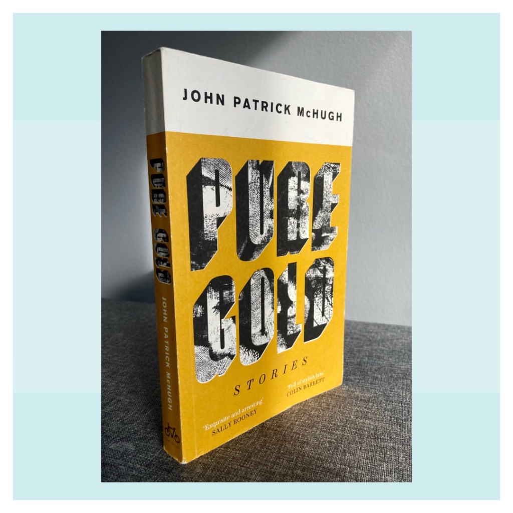
I came across your work when I read Pure Gold by John Patrick McHugh. Can you tell us a bit about that project?
I love that book! John is a fantastic writer. This was my first time working with New Island books and it was a dream. I had a long chat with commissioning editor Aoife Walsh about New Island and their approach as a publisher. I really like what they do, and Aoife and the rest of NI are very engaged with the cover as part of the publishing process. She passed on the manuscript of Pure Gold and I had a read. The stories are brilliant, and John has this amazing voice of a writer who has a very strong identity in the writing, but not in such a way that it takes over the stories if that makes sense? The cover is quite simple – it’s type and colours and textures, but hopefully it captures the tone of John’s voice and the character of the stories. I think these are my favourite types of covers, the ones where there’s almost no figurative elements, but they feel right. I can’t wait to read what John does next.
Could you talk to us about a cover that came really easily to you? And another where it took you longer to achieve the final version?
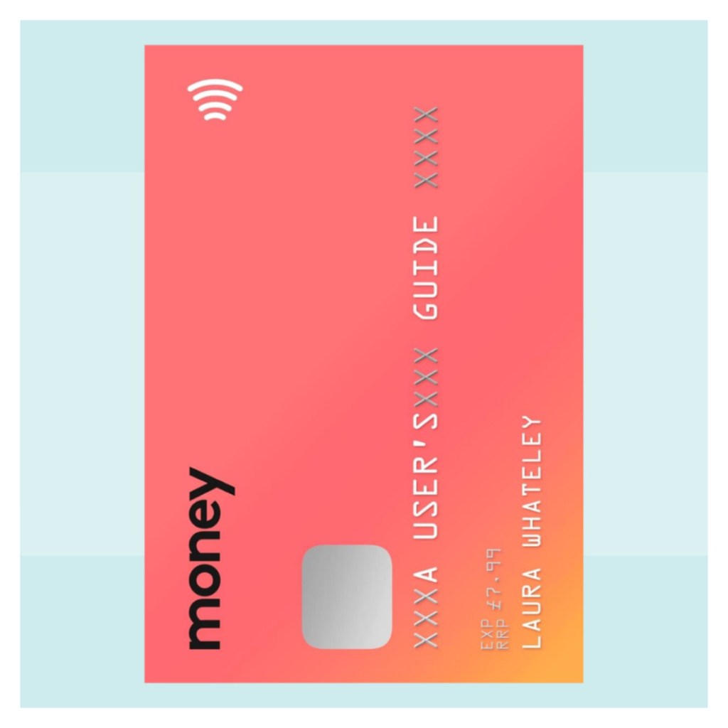
The cover of Money by Laura Whateley was quite a quick concept. I was working in-house at 4th Estate at the time, and the Art Director Julian Humphreys was talking to Publisher Michelle Kane about this book she was publishing called Money. They were discussing the publishing direction and what kind of look it needed and, because I’m nosey, I interrupted and said we should make it look like a Monzo card (Monzo is like the Uk version of Revolute) and that was pretty much it! That’s something I miss about working in-house – conversation can throw up ideas in quite an unexpected (and in this case interrupted) way.
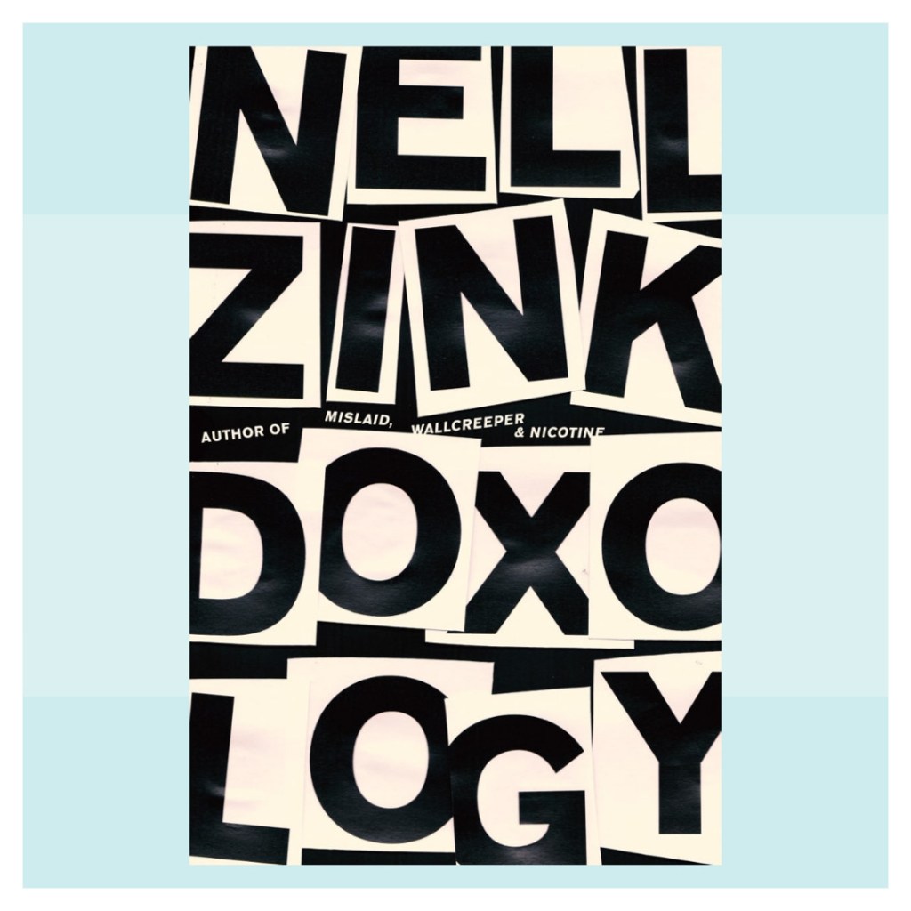
Also at 4th Estate, I also worked on Nell Zink’s novel Doxology. In contrast, this was a bit of a nightmare, but it’s one of my favourite covers I’ve worked on. I had read and loved the novel and had spent 2 months working up dozens of covers for it. I worked up illustrations, collages, photographic routes, but none of them were ever quite right and each was rejected in turn. I eventually realised that the only thing that I really liked of any of the iterations was the title and author name. So I printed the letters out a little too big for the cover, cut them up, prit-sticked them back into the correct proportions, scanned the page and the cover was done. It’s a very simple cover, but I never would have got to that end result had I not worked through months of dead ends. It taught me a lot about process – you can achieve a very simple outcome but sometimes it takes a complicated route to get there.
You have worked in-house with some really big publishers, and are now freelance. What are some of the joys and perils of being freelance in the world of graphic design?
The joys are getting to work with so many wonderful people and publishers. Each job is different because of the people involved and I love experiencing that with such a variety of clients. I’m also happy to never ever be in a meeting again as long as I live. I found that a lot of my time working in-house was spent talking about doing the work instead of actually doing it, and now I spend 95% of the day actually working, which I love. Companies love meetings but most of the time they are a waste of time in my experience!
I miss working with other designers though. Talking about work you’re doing can be a really important part of the process, and can be very insightful. I really missed this when I first went freelance, but I’m getting around it by making sure I meet other designers as often as I can for a pint and to talk about work.
Who do you like to read in your own time? Is there someone out there you would love to design for?
I’m such a slow reader that these days I almost exclusively read for work. I can’t complain though as it often means I read stuff I never would have picked up, and that’s often the best reading experience.
I’d love to design a Flann O’Brien backlist or maybe Kevin Barry. That’s not to say that those authors don’t have wonderful covers, but I really love their work, and sometimes that’s a real challenge for me. I think it can be really tricky to design a cover for a book or author you love, as silly as that sounds. It can be hard to get out of your own way and not let the weight of your own expectations cloud the process.
But to be honest, I’m finding working on covers for new authors very exciting. There’s a specific thrill that comes with reading a manuscript from a debut author and realising that you’re working on something special.
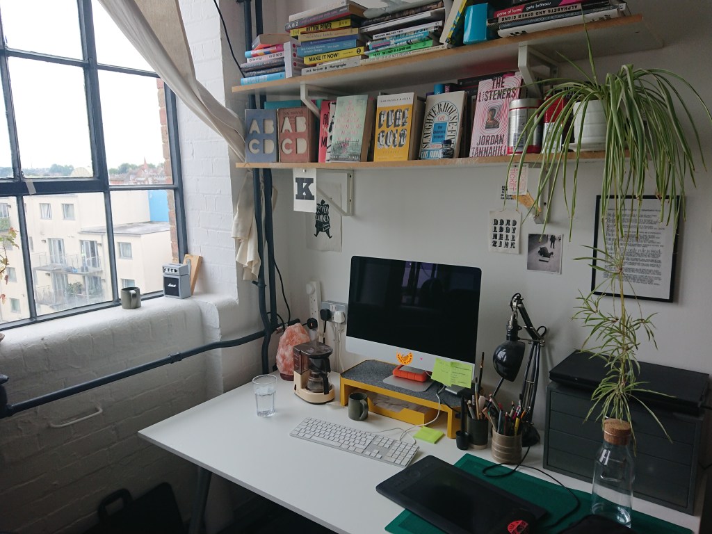
I always love getting an idea of the space behind the magic. Could you give us an idea of what your workspace is like?
I share a studio space with Photographer/Art Director/Designer Lorna Allan and Illustrator/Author/Fellow Irishman Steve McCarthy in the Bussey Building in Peckham. It’s an old cricket bat factory and has these nice big old industrial windows and radiators and fixtures that are definitely older than I am. I’ve been there less than a year but I’m kind of obsessed with the place – I find myself making excuses to go in and hang out and potter around there on the weekends!
Early in your career, you were designing in Tower Records, where you would have been surrounded by some great vinyl covers. Are there any album covers that come to mind as having shaped or inspired your early approach to design?
I cannot overstate how important Tower Records was to me. Clive & Joe (the managers at the time) gave me my first design job when I was absolutely not qualified and got me started down this path. I worked in Tower for over 5 years, and the exposure to such a volume of music, films and books through everyone who worked there was a life changing experience.
While I can’t pick out a record sleeve that may have inspired me, there is something I observed about vinyl culture which I think was very formative. I was working there as people started to buy vinyl again in the face of digital music streams and increasingly shitty cd packages. Seeing people appreciate and collect a big, physical format highlighted to me the importance of every aspect of that format, including the cover. I think it made me realise that the physical object is important and that it has an enduring place in people’s lives, regardless of how digital all these media go.
So what lies ahead? Have you any projects coming up, professional or personal, that you can tell us about?
I’m starting to think about moving back to Ireland, and that’s a pretty big one for me. I’ve been in London for more than 8 years, and it’s been very good to me. It’s daunting to think of such a big change, but it’s also exciting to set up back home and have another new start.
***
A huge thank you to Jack for sharing these rich insights with me.
So if you think Jack’s the man for your next book cover project, or just want to browse his archive of visual treats, head on over to his website www.jacksmyth.co and enjoy.
***
Image credits: desk space, Doxology cover and Money cover courtesy Jack Smyth.

One response to “Interview – Jack Smyth – Book Cover Designer”
[…] also recently chatted to The Resting Willow blog about book covers, including his design Pure Gold by John Patrick […]
LikeLiked by 1 person